Solar Cell Powered Motor: Graphing
1 Overview
You will measure the rotational frequency of a disk that is powered by exposing a photovoltaic cell to a bright light. You will investigate how the disk’s frequency changes with the brightness of the light.
2 Learning Goals
After completing this week’s lab, you should be able to:
- Create a plot using Excel that includes labels, a trendline, and a caption.
3 Open Your Notebook
Open your OneNote lab notebook and verify it is syncing before starting. If you need help, see the OneNote Setup.
4 Explore: Equipment and Observations
In this section you will play with all of the equipment to become familiar with what everything does.
A photo of the provided equipment is shown in Figure 1.
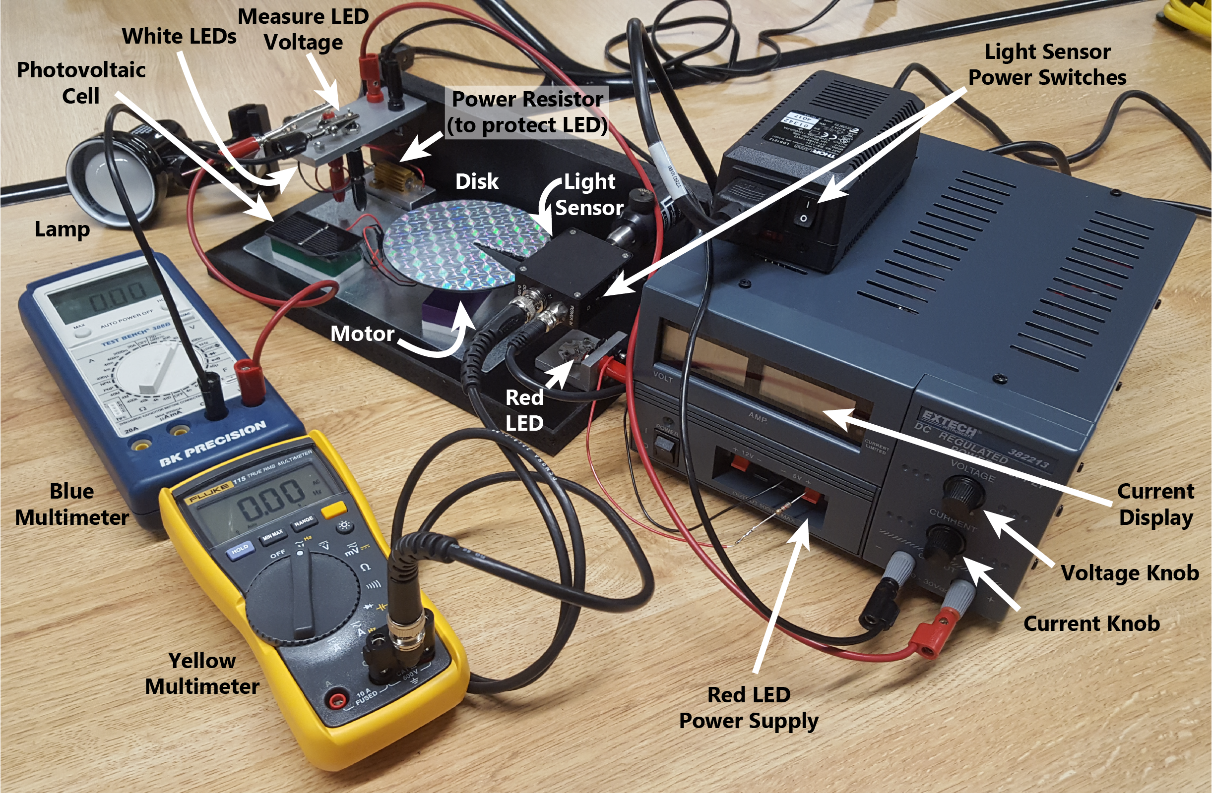
Pull the photovoltaic cell and the motor off of the setup (they’re just attached with magnets) and use a desk lamp to power the motor. Play with all of your equipment until you have a good idea how everything works. Here are a few helpful notes:
- As you turn up the voltage knob, you may hit the current limit. (You can turn up the current knob, allowing the voltage to increase.)
- Your light detector has a power switch on both the power cord and the device itself.
- The light detector also has a “gain” knob that changes how much it amplifies the signal. You may need to adjust this gain to not have too small or too large a voltage to be read by the multimeter.
- Sometimes, a brief push is needed to start the disk into motion.
- The light sensor’s output is a voltage that is related to the amount of light that strikes the sensor.
- You will be measuring voltage with your blue multimeter, so your cables should be plugged into the “COM” and “\(V\Omega\)” ports, NOT the “A” ports (which are for current measurements only).
- Set the dial on the blue multimeter in the V area (the upper right) to measure voltage. The numbers within that range indicate the maximum value the meter is set to measure (in Volts). 40 should be sufficient for this activity.
- Your yellow multimeter can also be set to \(\overline{V}\) (with a dashed line above) to measure a steady (DC) voltage, or \(\widetilde{V}^{\,\text{Hz}}\) to measure an alternating (AC) voltage.
- When the yellow multimeter is set to \(\widetilde{V}^{\,\text{Hz}}\), you can press the yellow button to measure frequency of the signal (in units of Hz).
Record some observations in your notebook:
- Explain in your own words how the rotational frequency of the disk is determined.
- What is the minimum voltage and current required to maintain the disk in motion (if given a brief push to get started)?
- What is the maximum frequency you can achieve with your setup?
You may now move on to Section 5, and make a prediction based on the observations you made.
5 Predict: Frequency vs. Power
The rate at which the white LEDs convert energy is given by \(P = VI\) where \(P\) is the power (in Watts), \(V\) is the voltage measured across the LEDs, and \(I\) is the current measured on the power supply (see Figure 1). This energy is converted into either light or heat. Some of this light is absorbed by the photovoltaic cell and turned back into electrical energy to drive the motor, which spins the disk.
Based on these facts and your initial observations, record a prediction in your lab notebook: how do you expect the frequency of the disk will depend on power delivered by the supply?
6 Gather and Analyze Data: Frequency vs. Power
Measure the frequency of the disk as a function of the voltage across the white LEDs and the current passing through them. Take at least ten data points, each with an estimated uncertainty in the measurement of the frequency. Estimate the uncertainty in each frequency reading from the resolution and fluctuation of the multimeter display. Include points at and just above the minimum brightness required to maintain the disk in motion. Record all data in an embedded Excel spreadsheet in your OneNote notebook with labeled columns and units.
You now have measurements of how disk frequency varies with LED voltage and current. To visualize this relationship, you will need to compute the power dissipated by the LEDs (\(P = VI\)) and create a plot of frequency as a function of power. If this is your first time making a plot in Excel, see Section 8 for a walkthrough of the tools available. Add a new column in Excel for the computed power — remember that to perform a calculation, you type “=” before the expression, for example, “=A2*B2”.
Think about what your plot needs to communicate. You have uncertainties in your frequency measurements — how should the plot convey those? You don’t yet have a complete theoretical model for how disk frequency depends on LED power, but you can use a trendline as an indication of the functional form. Use a polynomial trendline and choose the lowest order that reasonably fits your data.
Once you’ve made your plot, consider: can you see the error bars, or are they too small to see? If you cannot see them, is this ok or should you make them artificially larger so you can see them?
Check your plot against the publication-quality checklist in Section 9 before finalizing.
Create a plot of frequency vs. power and import it into your notebook. Your plot should include error bars, a polynomial trendline of the lowest order that reasonably fits your data, and an appropriate caption.
7 Reflect
Briefly, record your responses to the following in your lab notebook:
- Describe a challenge you encountered today while doing the lab.
- How did you respond to this challenge?
When you are done, follow the Turning In Your Notebook steps to export, clean, and upload your notebook PDF to Canvas.
Make sure you log out of the tablet computer before you return it to the cart.
8 Plotting in Excel
The example below walks through how a plot was created from a hypothetical projectile experiment. Not every plot will require every element shown here — which features you include depends on what your data need to communicate.
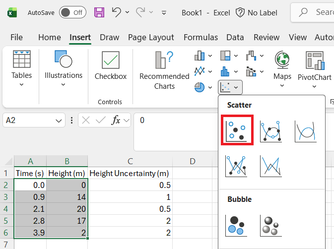
Creating the chart. Enter your data in columns with labels and units. Select the columns you want to plot — Excel plots the leftmost selected column on the horizontal axis. On the ribbon, click Insert, then the Scatter chart icon (Figure 2).
Adding chart elements. A chart appears — it won’t have labels or error bars yet. Click the + icon next to the chart to open the Chart Elements menu (Figure 3). From here you can add axis titles, error bars, trendlines, and other elements.
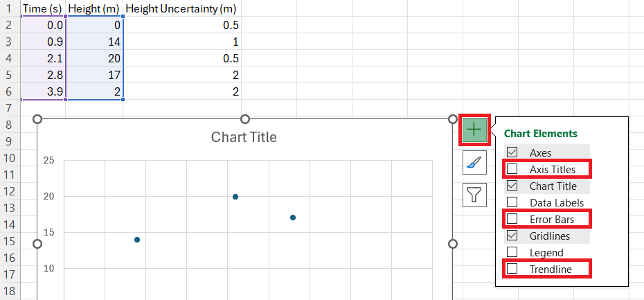
Axis titles. Check Axis Titles and label each axis with the quantity and units (e.g. “Time (s)”, “Height (m)”). Every plot should have labeled axes.
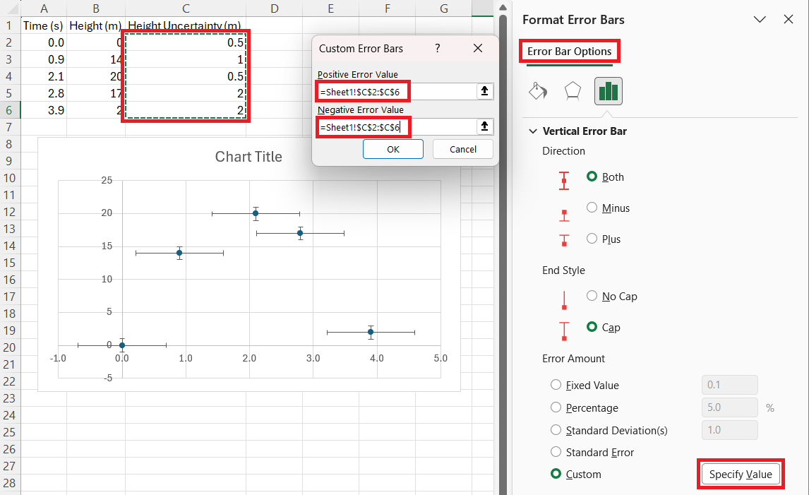
Error bars. If your data have associated uncertainties, check Error Bars > More Options to open the Format Error Bars panel. By default, Excel selects the X error bars. Use the drop-down at the top of the panel to switch to Series 1 Y Error Bars (Figure 4). Then select Custom > Specify Values, clear the default values in both the Positive and Negative Error Value fields, and select your uncertainty column. You can then delete the X error bars by selecting them on the chart and pressing Delete.
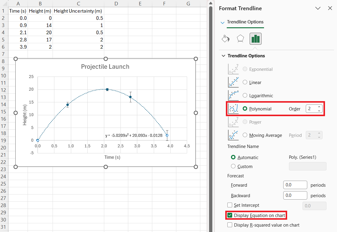
Trendlines. If you want to fit a model to your data, check Trendline > More Options to choose the type (Linear, Polynomial, etc.) and check Display Equation on Chart (Figure 5).
9 Publication-Quality Graphs
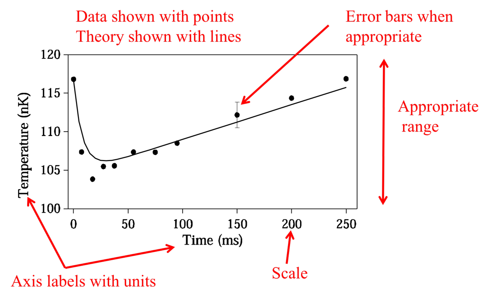
Figure 6 shows an example of a publication-quality graph from a research paper. Your Excel plots should include the same elements:
- Axes labeled with appropriate units
- Appropriate range of x and y axes
- Data plotted as points with error bars
- Theory or model plotted as lines
- A caption — the first phrase is the title of the graph, followed by a few sentences explaining the main findings of the data presented, including a description of the physical behavior represented by the data